

Before you start matching furniture to jarrah floors, it’s worth stepping back and looking at the bigger picture. A few key factors can make all the difference in how your space feels and functions with such a bold, statement-making floor.
From the tones you choose to the textures you mix in, every decision plays a part in creating balance. Let’s look at some important things to keep in mind before you settle on a style or start shopping.
Design Preference
Your overall design preference is the best starting point when decorating around jarrah floors. Whether you lean toward modern, coastal, traditional, or rustic styles, that choice will influence the furniture shapes, materials, and colours that feel right in your space.
Jarrah is versatile enough to work across styles, but the key is consistency. A clear aesthetic helps narrow your options and ensures your furniture doesn’t compete with the floor, but complements it.
For example, a contemporary look might call for clean lines, neutral upholstery, and light wood accents to contrast jarrah’s depth. A more traditional or country-inspired style could pair well with antique finishes, detailed woodwork, or muted greens and creams. Once your design direction is set, everything from dining chairs to coffee tables can work together to reinforce the atmosphere you want to create.
Tone Balancing
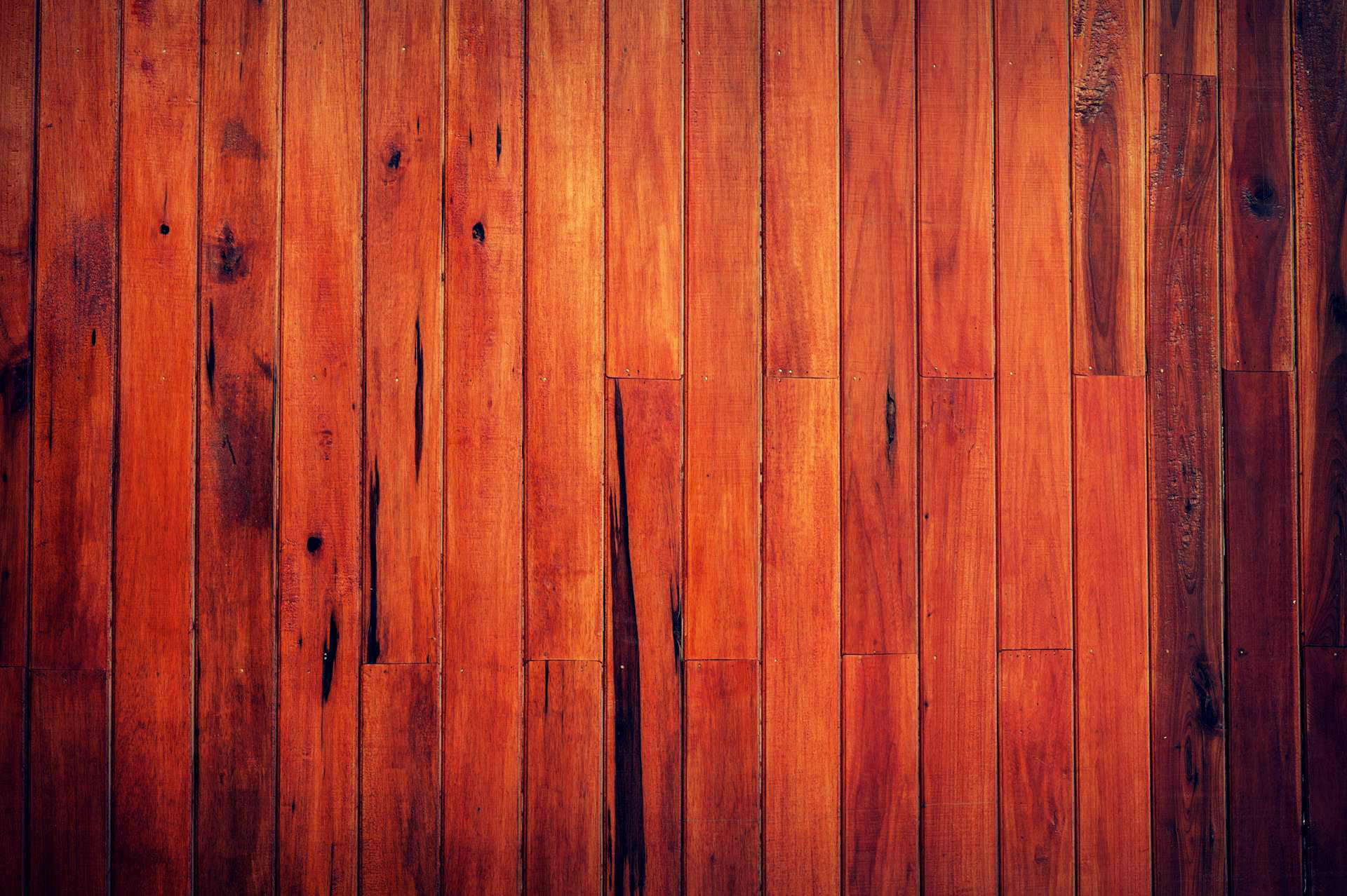
Tone plays a subtle but powerful role when pairing furniture with jarrah floors. At a glance, jarrah’s mass tone appears rich and reddish-brown, but its undertone is warm, often carrying hints of burgundy or rust. Understanding this distinction between mass tone (what you first see) and undertone (what’s revealed on closer look) is essential for choosing furniture that feels intentional rather than mismatched.
Warm undertones pair best with other warm elements, like golden or reddish wood furniture, warm neutrals, and earthy colours. Instead of trying to match jarrah exactly, focus on harmony. A mix of tones can work beautifully, as long as the undertones align.
For instance, even if your timber dining table is a lighter colour than the floor, it will still sit comfortably in the space if both woods share a warm undertone. This approach allows you to play with contrast and variation while keeping the overall look cohesive and visually calm.
Room Size and Lighting
Room size and natural light can dramatically influence how jarrah floors interact with your furniture choices. In smaller or dimly lit spaces, jarrah’s rich tones can feel quite dominant, sometimes making the room appear darker or more enclosed.
Choosing lighter-toned furniture is an effective way to offset this. Pale woods, soft fabrics, and neutral colours reflect light and create a sense of openness, helping to balance the weight of the flooring without competing with it.
In larger or well-lit rooms, you have more flexibility. Darker furniture can enhance jarrah’s warmth and create a moody, sophisticated feel but it’s still important to introduce visual breaks. This could be through rugs, metallic accents, or even white walls that lighten the overall look.
The goal is to avoid a space that feels too “bottom heavy,” where the floor and furniture visually sink the room. A thoughtful mix of tones ensures the space feels grounded but not weighed down.
Once you’ve settled on your design direction and materials, colour is the next big decision. Jarrah has a commanding tone, so the colours you bring into the room, through sofas, chairs, cabinetry, and even artwork, will either heighten its richness or help soften its impact.
The key is choosing colours that either contrast gently or harmonise without blending in too much. Some shades naturally work better than others with jarrah’s warmth and depth. Below, we’ll walk through a few furniture colour options that pair beautifully with jarrah floors, and a few you might want to steer clear of.
Charcoal or Deep Navy
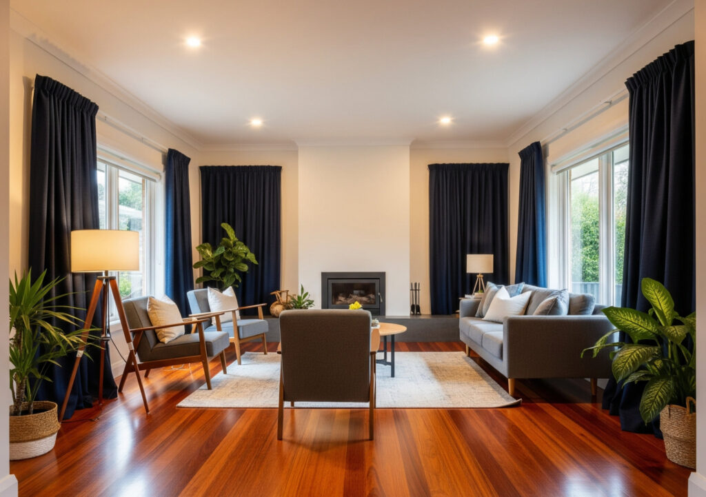
Charcoal and deep navy offer a bold yet balanced counterpoint to jarrah’s warmth, bringing depth and sophistication to the room. These darker tones work especially well in larger or well-lit spaces, where they won’t make the overall feel too heavy.
Against the reddish undertones of jarrah, charcoal introduces a cool contrast that feels modern and moody, while navy brings a touch of richness that complements the floor without blending in. These colours are ideal for accent pieces like armchairs, shelving, or even a statement sofa. They help anchor the room visually and can be used to highlight architectural features or create focal points.
When layered with lighter walls or metallic finishes, like brushed brass or matte black hardware, charcoal and navy can give your space a curated, high-end feel that lets jarrah shine without overpowering it.
Light Neutrals
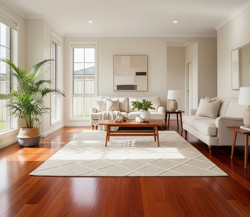
Light neutrals like beige, cream, and dove grey are some of the most effective choices for creating contrast against jarrah floors. These shades lift the visual weight of the space, preventing it from feeling overly dark or enclosed. When used on large furniture pieces like sofas, dining chairs, or sideboards, they introduce softness and clarity, making the deep tones of the jarrah stand out in a more intentional way.
This contrast also helps define the different layers of your interior. Light neutrals act as a visual “pause,” letting the floor remain a strong feature without letting it overwhelm the room. Dove grey, in particular, offers a cooler, modern edge without clashing with jarrah’s warmth, while creamy tones add a welcoming, casual feel that’s easy to layer with cushions, throws, or accent decor.
Sage or Phthalo Green
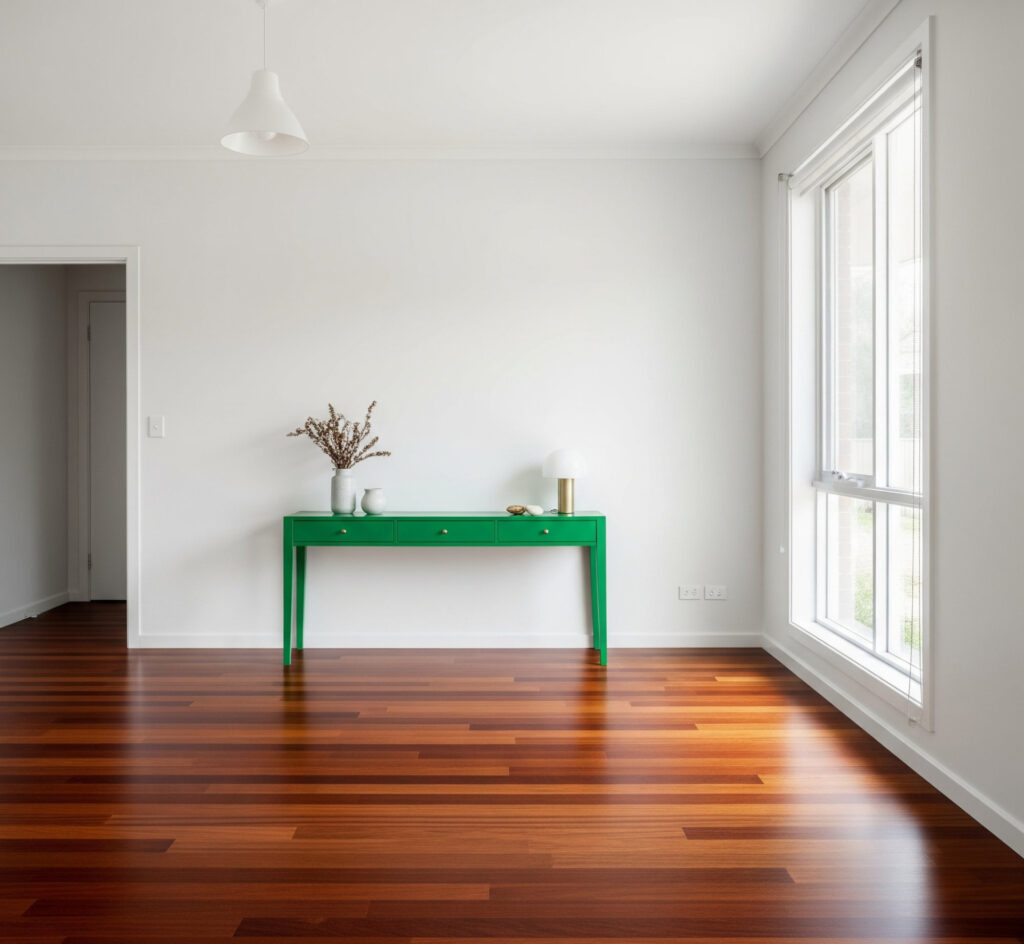
Sage and phthalo green bring an earthy, organic tone that pairs beautifully with the rich, reddish warmth of jarrah floors. These greens introduce a sense of calm and freshness, softening the boldness of the timber without competing with it.
Sage, in particular, has a muted, silvery quality that works well in relaxed or rustic interiors, while phthalo green, a deeper, more saturated tone, adds drama and a refined natural edge. Used thoughtfully, green can help tie together natural materials in the room, from timber and stone to leather and woven fabrics.
Whether it’s an upholstered chair, a painted cabinet, or even smaller accents like cushions or artwork, these tones enhance the grounding presence of jarrah while keeping the space vibrant and alive. They’re especially effective in rooms that aim to blur the lines between indoors and out.
Soft and Off-Whites
Soft and off-whites offer a crisp, clean backdrop that pairs beautifully with the richness of jarrah floors. These subtle shades, like ivory, chalk, or bone, don’t compete with the wood’s warm tones but instead help create a sense of lightness and modernity. When used in furniture upholstery or cabinetry, off-whites can make a space feel fresh and refined, especially in contemporary or minimalist interiors.
Unlike stark white, which can sometimes feel too cold or clinical next to jarrah, off-whites bring just enough warmth to maintain harmony. They allow the natural grain and colour of the floor to take centre stage while still keeping the room open and breathable. Paired with sleek silhouettes or matte finishes, soft whites can help strike a perfect balance between bold flooring and understated elegance.
Colors to Avoid
While jarrah floors have a warm, reddish undertone, layering them with furniture in similar shades, like strong reds, burnt oranges, or terracotta, can lead to visual overload. These colours often blend too closely with the flooring, causing furniture to disappear into the background rather than stand out.
Instead of complementing the jarrah, they can compete with its natural tones or amplify the warmth to an uncomfortable degree, making the space feel heavy or overly saturated. To maintain clarity and definition in the room, it’s better to steer clear of furniture in colours that mimic jarrah too closely. Without enough contrast, the space can feel flat or visually muddled.
If you’re drawn to warmer hues, opt for softer, earthier versions, like muted clay, dusty peach, or pale gold, that provide warmth without overwhelming the eye. The key is ensuring your furniture and flooring support each other rather than blend into one visual mass.
Upholstered furniture is a great way to soften the richness of jarrah floors and bring balance to a space. Fabrics like linen, cotton, and bouclé offer gentle texture and a natural feel that contrast beautifully with the density and sheen of hardwood.
Lighter fabrics in warm neutrals (such as oatmeal, ivory, or soft grey) can lift the room visually and make it feel more inviting, while still allowing jarrah’s colour and grain to stand out. These materials also introduce a tactile softness that offsets the hard surfaces of timber, helping the space feel more lived-in and layered.
Leather, when chosen carefully, can pair exceptionally well with jarrah. Tan and caramel tones work with the floor’s warm undertones to create a cohesive, earthy palette, while black leather adds a bold, modern contrast that grounds the space.
For those looking to introduce patterns, geometric prints can bring structure and a contemporary edge, especially in rooms with mid-century or modern influences. Floral or organic prints, on the other hand, soften the space and lean more traditional or country in feel. When using patterns, it’s best to keep the colour palette restrained so it enhances, rather than distracts from, the natural beauty of the jarrah flooring.
Jarrah’s bold, natural character makes it surprisingly adaptable across a range of interior design styles. Whether you’re drawn to clean lines, vintage charm, or earthy textures, there’s a way to let this timber flooring enhance your aesthetic.
The key is choosing a style that complements jarrah’s depth without overwhelming the space. Below are a few design approaches that pair especially well with jarrah, each bringing out a different side of the timber’s personality.
Mid-Century Modern
Mid-century modern design pairs effortlessly with jarrah flooring thanks to its emphasis on clean lines, functional form, and warm timber tones. Walnut furniture shares a similar depth and richness with jarrah but brings enough tonal variation to create interest without feeling too matched.
The streamlined silhouettes of mid-century pieces, from tapered-leg chairs to minimalist sideboards, keep the look refined and uncluttered, allowing jarrah’s natural grain to stand out. Accent colours play a key role in bringing this style to life. Mustard, teal, burnt orange, or olive can be introduced through upholstery, artwork, or decorative objects to create a lively contrast against the deep flooring.
With jarrah as the base, mid-century modern interiors take on a slightly moodier, more grounded feel; ideal for those who want a blend of vintage charm and contemporary edge.
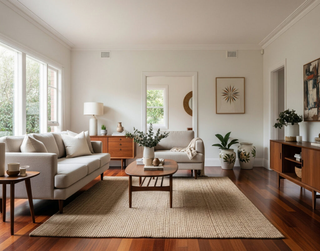
Modern Australian
Modern Australian style embraces the warmth and texture of natural materials while keeping the overall look light, open, and easygoing, making it a perfect match for jarrah floors.
This design approach leans on pale, sun-washed tones like soft whites, sandy beiges, and muted greens to contrast jarrah’s richness and keep the space feeling grounded yet airy. Clean-lined furniture in natural fabrics like linen or cotton adds a relaxed sophistication without overpowering the floor’s character.
The beauty of this style is its subtle layering of textures: timber, rattan, leather, and stone all sit comfortably alongside each other. Jarrah acts as the visual anchor, allowing other natural elements to build around it.
Think low-profile sofas, open shelving, and furniture that feels functional yet inviting. The result is a space that feels distinctly Australian: warm, breezy, and deeply connected to its materials.
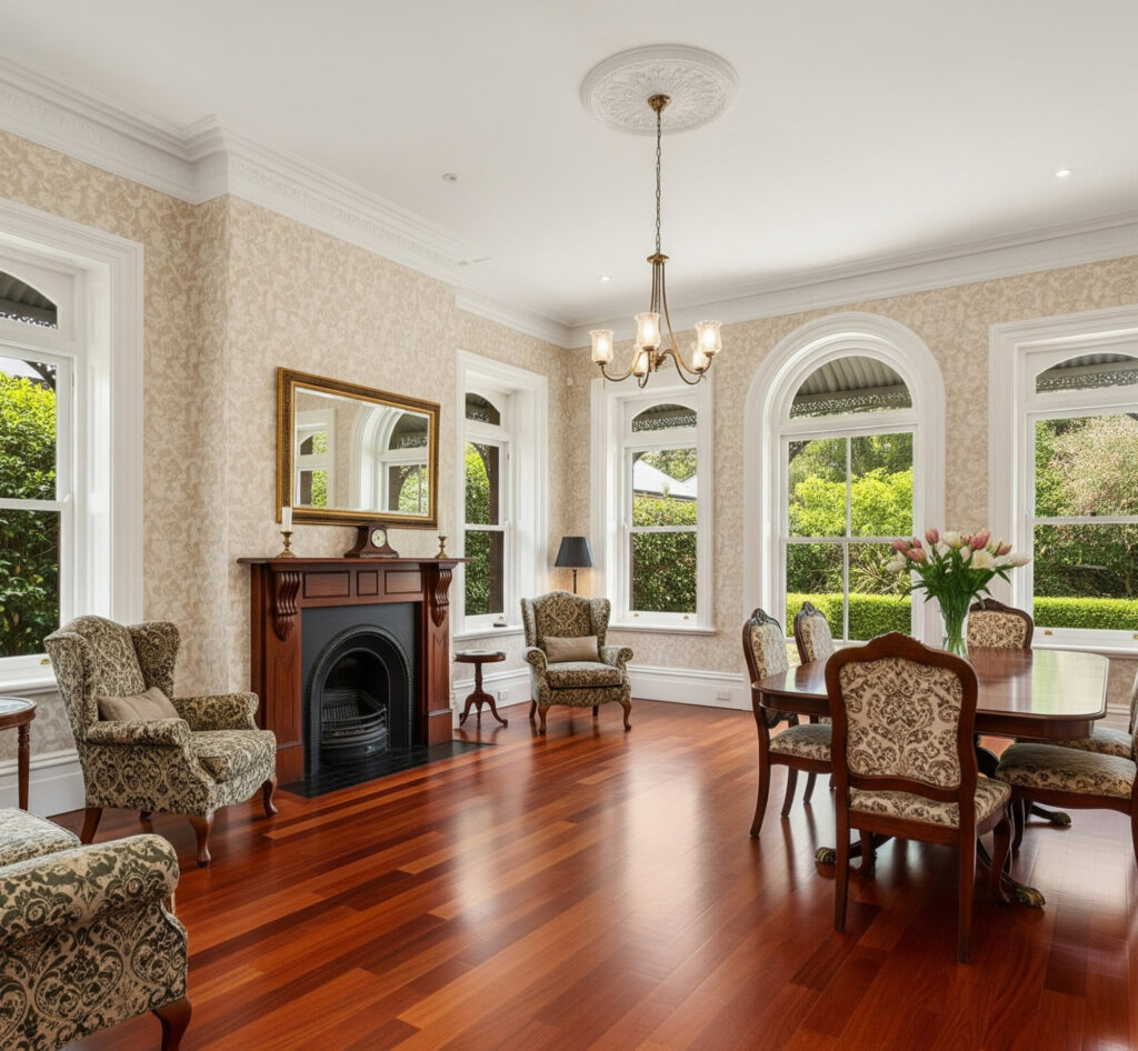
Classic Colonial
Classic Colonial interiors lean into tradition, refinement, and a sense of permanence. These are qualities that align beautifully with the bold, enduring nature of jarrah floors. This style often features dark timber furniture with ornate details like turned legs, carved edges, and antique brass hardware. These elements echo jarrah’s richness while reinforcing the formal, heritage-inspired tone of the room.
When paired with deep colours, such as navy, forest green, or burgundy, colonial spaces take on a stately elegance that feels timeless rather than dated. To avoid the space becoming too heavy, layering is key. Rich textiles like velvet or brocade can be balanced with lighter wall colours or soft, patterned rugs to create breathing room.
Jarrah’s depth grounds the look, providing a strong visual base that complements the decorative elements rather than competing with them. The result is a warm, cohesive space that feels rooted in history but still welcoming and liveable.
Once your main furniture pieces are in place, accent elements help tie the whole room together and elevate the space beyond the basics. With jarrah floors as your foundation, these finishing touches can either soften the overall look or add contrast where needed.
From floor coverings to metallic details and wall art, each piece plays a role in balancing the boldness of jarrah. Below are a few types of accent decor to consider, each offering a way to complement the flooring while adding texture, colour, and personality to the room.
Metal Accents
Metal accents are a smart way to introduce contrast and definition when working with jarrah flooring. Because jarrah has such a warm, earthy tone, cooler or more neutral metals like brushed nickel or matte black can cut through the richness and bring in a modern edge.
These finishes work particularly well on light fixtures, furniture legs, cabinet handles, or decorative pieces, adding sharpness and variation without overwhelming the natural materials in the room. For a warmer, more refined look, aged or brushed brass can complement jarrah’s undertones while still standing out. This pairing works especially well in spaces that lean traditional, mid-century, or classic in style.
The key is to use metal sparingly and intentionally, too much can feel cold or industrial. But when used thoughtfully, these accents add a layer of sophistication and help visually connect other materials like stone, fabric, or timber throughout the space.
Rugs
Rugs are one of the most effective tools for visually breaking up large stretches of jarrah flooring. Because jarrah has such a strong, warm presence, a light-toned rug (whether in cream, soft grey, or muted beige) can create contrast and define zones within a space.
This helps prevent the room from feeling too dark or heavy, especially in open-plan layouts. Choosing a rug with subtle texture or a low-key pattern adds interest without distracting from the natural grain of the wood. In addition to softening the look, rugs bring warmth underfoot and help absorb sound, adding to the overall comfort of the space.
Materials like wool, jute, or cotton blend particularly well with jarrah’s organic character, while layered rugs or oversized pieces can help scale up the visual balance in larger rooms. The goal is to choose rugs that lighten and anchor the space at once, providing visual relief while enhancing the beauty of the floor.
Wall Art and Accessories
Wall art and accessories play a vital role in pulling a room together, especially when working with the bold presence of jarrah flooring. Art adds personality and visual balance, whether through colour, scale, or texture.
When choosing pieces, look for artwork that either introduces lighter tones to lift the room or echoes some of the existing materials, like warm neutrals, deep blues, or soft greens. Large-scale pieces can anchor a wall without competing with the flooring, while gallery-style arrangements offer movement and visual rhythm.
Accessories like cushions, throws, ceramics, and plants offer the chance to tie your colour palette together across different layers of the room. These smaller pieces can pick up tones from your rug, walls, or furniture and subtly repeat them, helping the space feel intentional and balanced.
With jarrah as your base, even a simple combination of textiles, vases, and art can be enough to complete the room, just keep the palette restrained and the materials natural to let the floor remain the anchor.
When working with timber as visually rich as jarrah, the finish of your furniture makes a real difference. Matte or satin finishes tend to complement jarrah more naturally than high-gloss surfaces, which can compete with the wood’s texture or create an overly polished look.
These softer finishes help maintain a warm, grounded feel that lets the natural variation of the floor remain a focal point. Avoid the temptation to overmatch your furniture and decor to the flooring. Uniform wood tones and perfectly coordinated colours can make a room feel flat or dated. Instead, aim for contrast, variety, and layering.
Add greenery, whether through potted plants, hanging foliage, or even a vase of branches, to bring a sense of freshness and life that balances jarrah’s warmth. Natural elements like this can lighten the space and prevent it from feeling too formal or static.
Finally, don’t be afraid to experiment. Try out colour swatches, fabric samples, or mock layouts before committing to big purchases. Jarrah offers a strong foundation, but the most successful interiors build on that with a mix of tones, textures, and styles.
Trust your eye to find the right balance, one that feels personal, not overly polished. A bit of contrast, a bit of restraint, and a willingness to mix things up will go a long way in making the room feel layered and lived-in.
